10 Simple Landing Page Tweaks That Will Supercharge Your Lead Generation Machine

“Subscribe!”, “Join us!”, “Sign up now!”
Customers come across these words all the time, and they all serve the same purpose: click here and enter your email address. But, do they have the same impact? Can a few words change the way your prospects feel about a button?
The short answer is yes. People click on a headline or a button because a single word struck a chord or engaged them in some way. Successful small business owners work hard to find the best converting words that can help them reach their goals.
Now you are probably wondering: if a single word can make such a difference, then how can other elements of a landing page impact lead generation?
Without further ado, here’s how small changes can have a big impact on increasing lead generation.
- Find Your Form Field Sweet Spot
No matter how compelling your offer is, visitors will pass it up if you ask too much information. People on the Internet are lazy, and they will ignore anything that requires too much effort or attention. While some of your visitors might start to complete the forms, most of them will instantly become uninterested if you ask too much of them.

Just think about it for a second, if you are just building your email list, do you really need to ask for the visitors’ phone number, address, city, zip code, and their firstborn son? Of course not! All you need is a name and an email address. Later, as they move through the sales funnel, you can ask for additional information.
- Punch up Your Headline
Psychologist Ellen Langer did a fascinating experiment to test the power of a single word. According to Buffer.com, she tried three different ways of asking the same thing:
“Excuse me, I have five pages. May I use the Xerox machine?”
“Excuse me, I have five pages. May I use the Xerox machine because I’m in a rush?”
“Excuse me, I have five pages. May I use the Xerox machine because I have to make some copies?”
Out of these three options, which one do you think got the most positive answers?
There was nothing special about Langer’s request, but, according to the experiment, the questions that included the word “because” got the best reactions (94% and 93%).

People react to different words in different ways. The word “because”, for instance, persuade people to take action because it gives them a reason.
There’s no question about it – words can have a big influence on your lead generation campaign. Every landing page should have a compelling headline that clearly mentions the offer and the benefits.
Example: “Free eBook to Mastering the Art of Writing Magnetic Headline”
- Cut Unnecessary Copy
A landing page’s purpose is not to explain what your product is or does. This is what your website and blogs are for. Your landing page should be a tool that helps you generate leads, and eventually sales.
If your landing page looks like a long-form article, then it’s probably a good idea to shorten your copy. Remove any unnecessary information that might prevent visitors from finding the value of your offer. Keep copy short, clear and engaging. It is better to have fewer words and a strong call to action than hundreds of words without any value.
- Make It Easy to Scan
Formatting is another minor tweak that can significantly improve your lead generation campaign. You may only have 100 words of engaging copy on your page, but if it’s all in one big block of text, your efforts are in vain.

Users spend very little time actively engaged on a page, and if your text isn’t easy scannable, then they will spend even less time. Use bullet points to break up text and to highlight the value of your offer. Write short sentences and short paragraphs to keep them reading until the end.
- Remove Distractions
Think of your prospects as kids in a toy store. If you give them too many choices, you will never get them to take action. That’s why it is important to keep the design of the landing page as minimalistic as possible, and to focus only on the important aspects of your business. Remove the navigation menu, follow me modules or CTA buttons for other offers.
- Include Something Compelling Visually
Humans are visual creatures, so it’s no wonder that photos, infographics, videos, and memes perform better in terms of engagement and conversion. If your landing page doesn’t include some kind of visual, this step alone can significantly damage your lead generation machine.

Use close-ups of faces that resemble your target audience to boost conversions. Also, use images of people facing to the right side. Users are likely to follow this directional cue and read your ad.
- Test Different Button Colors
You are spending time and money to drive prospects to your landing pages. You want them to click on your buttons and convert into leads. But, what if your buttons are the wrong color?

Color plays a big role in your customer’s decision-making process and can have a different effect on people. For example, red creates a sense of urgency and is often used for sales. Blue is the color of trust, order and loyalty and is often used by banks and professional businesses to convey a sense of security.
It’s not far-fetched to say that the right color can increase website conversion rate over another color. There is plenty of data that indicates that color can be up to 85% of the reason people decide to buy.
- Tell Them What to Do
You have only a few seconds to get your prospects’ attention, so make sure to tell them exactly what you want from them. Do you want to get their email addresses? Then, have the designers create a big arrow pointing to your lead capture form. Do you want them to download your new eBook? Make the download button as visible as possible.
- Include Social Proof to Build Trust
Your prospects are more likely to give you their email addresses if they trust your website. More than that, they are more inclined to join an email list if they know 17,000 other people already subscribed.

Another great way to build credibility is to include popular logos of images of media outlets that mentioned your business. Be careful not to clutter your landing pages with images of brands, and use them wisely.
- Never Stop Split Testing
One of the greatest lead generation pitfalls small online business owners fall into is that they never test. They assume that they chose the right design, the right color scheme or the right copy. But, if you have a tight budget, you can’t afford to throw darts in the dark.
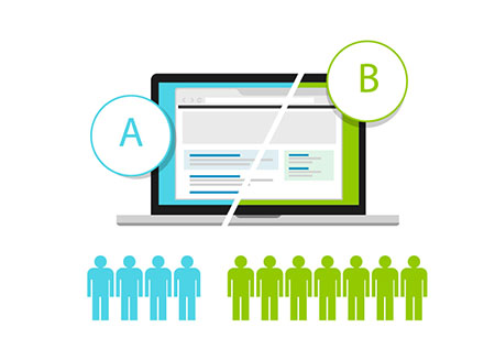
A/B testing is a great way to test even the smallest changes to your page. You can (and you should) test everything across your website, from the placement of social media buttons and calls-to-action to different headlines and different images.
Generating leads can seem like a challenging task. There are so many things you need to take into account, and that can impact your revenue. But, with small tweaks like these, you can supercharge your lead generation machine and boost conversions.
What other landing page tweaks have you successfully implemented? Share your thoughts and experiences in the comments section below.

Leave A Comment